
We’re launching a refreshed brand and logo!
Our new logo is a fresh, modern look – reflecting the high-quality care and innovation ACH Group is known for.
Current core elements remain including the distinctive green and the page turn image that symbolises looking to the future and the possibilities for all as we age. These elements make the ACH Group brand well-known, resonate with our community, and reflect our purpose – Good Lives for Older People.
![]()
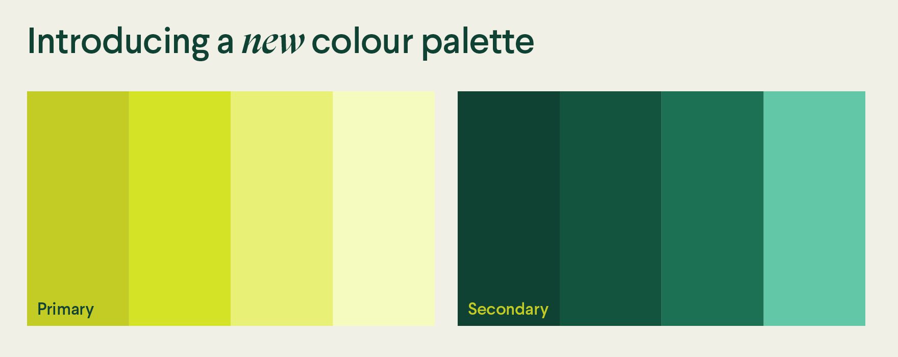
The colour palette has also been expanded, strengthening ACH Group’s ownership of green and distinguishing us from many aged care providers.
The refreshed look introduced from mid-October 2024, replaces the former logo and branding that was developed 14 years ago. The need for a new logo was identified due to the evolution of ACH Group and the change in the aged care sector in the last decade.
You’ll see this new look on tv, social media, cinema screens, your way to work, and more.